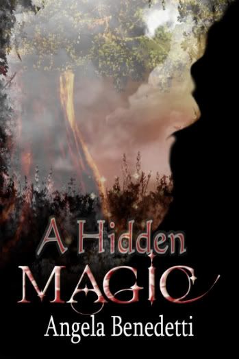
Fey incursions into the mortal world have been on the rise lately, and Paul MacAllister's trying to figure out what the king of the local elven enclave Under the Hill is up to and how to stop it. Rory Ellison was caught up in one of those attacks and nearly killed by a gang of goblins. He doesn't believe they were real, though, and is resisting anything Paul might say to the contrary.
Normally Paul would be willing to let Rory go his own way, at least until he's taken care of more immediate business. But Rory has a particularly rare gift, one the elven king needs to have under his control in order to carry out his plan. Keeping Rory away from the fey who'll use him -- to death if necessary -- means protecting him night and day, whether Rory agrees or not.
============
Working with my artist, Skylar Sinclair, was interesting, and less stressful than I'd been anticipating. [wry smile] Skylar was eager to get my input, and to try different things to make sure I was pleased with the final result, which I am. I was half afraid I'd end up with a two-nekkid-dudes cover by marketing fiat or something. Not that I can't appreciate a nice looking nekkid dude :) but this isn't that kind of book; having people see a nekkid-dude cover and buy the book expecting a lot of sex, then be disappointed and say disappointed-type things on their blogs would've been Very Bad.
Skylar suggested another stock photo site, iStockphoto, which I have to say is better organized than that other one I mentioned a while back. Or at least, the photographers who hang out there are better able to sort their pics into the proper categories, or maybe they just have staff to weed out the blatant errors. Whichever it is, it's not perfect, but the glitches were minor rather than being a significant percentage of the whole, which was much appreciated on my part when I was combing through pages and pages and pages of thumbnails.
I actually found three models who could've worked for Paul, my main protagonist. None were perfect -- a bit too young, a bit too pretty -- but they all came closer than I'd honestly expected. Stock photo models tend to be either fitness/underwear type models, very young and very pretty and very ripped, with lots of skin showing, or they tend to go in the other direction and be photographically interesting but not necessarily the sort of face one would write a romantic fantasy about. Paul's sort of between the two, but most of his attractiveness is charismatic rather than classic handsomeness, much less prettiness; I wasn't really counting on finding anything even vaguely appropriate.
When I did, Skylar picked one of the three which she thought went best with the art and superimposed the face over the lighter foliage section of the picture, sort of a misty blending thing. I'm sure there's some technical term for it of which I'm ignorant, but hopefully that's descriptive enough? [squint]
Anyway, I stared at the two of them for a while. I really liked the photo Skylar chose, and I'd wanted a character on the cover, assuming I could find one that worked, and I had. But at the same time.... Huh. I liked the one with the face, but there was something about the one without -- in the one with the face, the focus was the face. The rest of the image was relegated to background, and didn't draw the eye or have anywhere near as much impact. In the one without the face, the focus is on the landscape, on the setting, which I think draws one in and creates an atmosphere of fantasy without actually having pixies flying around in it. Skylar said she liked that one best as well, as did the head of the art department, but that it was my choice.
I thought about it overnight, and decided to go with the one without the face. It's good to have a specific picture of Paul in my head now -- I'm really not good at coming up with specific facial images out of whole cloth, and my characters are more collections of characteristics in my head than actual faces -- but I decided that as a cover, the picture with the landscape alone worked better.
As it is, the cover suggests a fantasy world, something beautiful and mysterious Out There, something that beckons an explorer. It's completely different from anything I'd envisioned while trying to figure out what kind of cover I wanted, but looking at it, I think it works wonderfully. Of course, that's why Skylar's the artist and I'm not. :)
Angie
4 comments:
A gang of goblins...now that is very, very fascinating!
Yes, to entice is better.
Bernita -- goblins are sort of the street gangs of the fey. They're individually weak and cowardly, but in a gang they can be dangerous. :/
I had fun deciding what sorts of creatures to use in the book. One I made up out of whole cloth, including digging around in Old English dictionaries trying to piece together a name. Hopefully everyone else will enjoy reading it as much as I enjoyed creating it. :)
Thanks!
Angie
Definitely a bit mysterious and mythic. I like it.
Charles -- thanks! :D
Angie
Post a Comment